Can you see the light at the end of the tunnel? Can we name the year 2020 – “the tunnel” and 2021 – “the light”? Surely, most of us look brighter in the future, with hopes and expectations. Humanity needs light now more than ever and needs to be as solid as rock at the same time. Light is yellow, rock is gray. Have you heard of the colors of the year 2021, just announced by Pantone?
Why am I suddenly talking about the colors? Because colors have the power, to calm our eyes and souls, or to stimulate, to energize us. Colors communicate, make things beautiful, describe, and inspire. We like to look up at the dreamy blue sky with clouds white as sugar, laying in the juicy green grass. Did you get this picture in front of your eyes? Exactly my thought. This is the power of the colors.
And what is Pantone? In 1963 Lawrence Herbert, chemist and commercial printing worker has developed a system for matching, communicating, and classifying colors. As we know, everyone perceives colors differently. When you say blue, some people will immediately see a blue sky. But to be more specific, it can be azure blue, like the sky during a clear sunny day, or midnight blue sky. Other people will imagine a blue ocean, but what if the ocean can also be emerald green? Let’s take a real-life situation: a husband buys gloves for his wife who wished to match them with her red scarf, but the red in her imagination can be a completely different red than the one that the husband imagined. So, the gloves are blood red and the scarf is chili red. Do you see my point?
Coming back to our colorful hero, Mr. Herbert knew that the color spectrum is seen and interpreted differently by each and every one of us. Knowledge, work, imagination, and normal human desire to make money led him to create the perfect color scale – the Pantone® Matching System® (or shortly PMS). Herbert also bought up his employers’ shares and changed the name of the company he worked into Pantone.
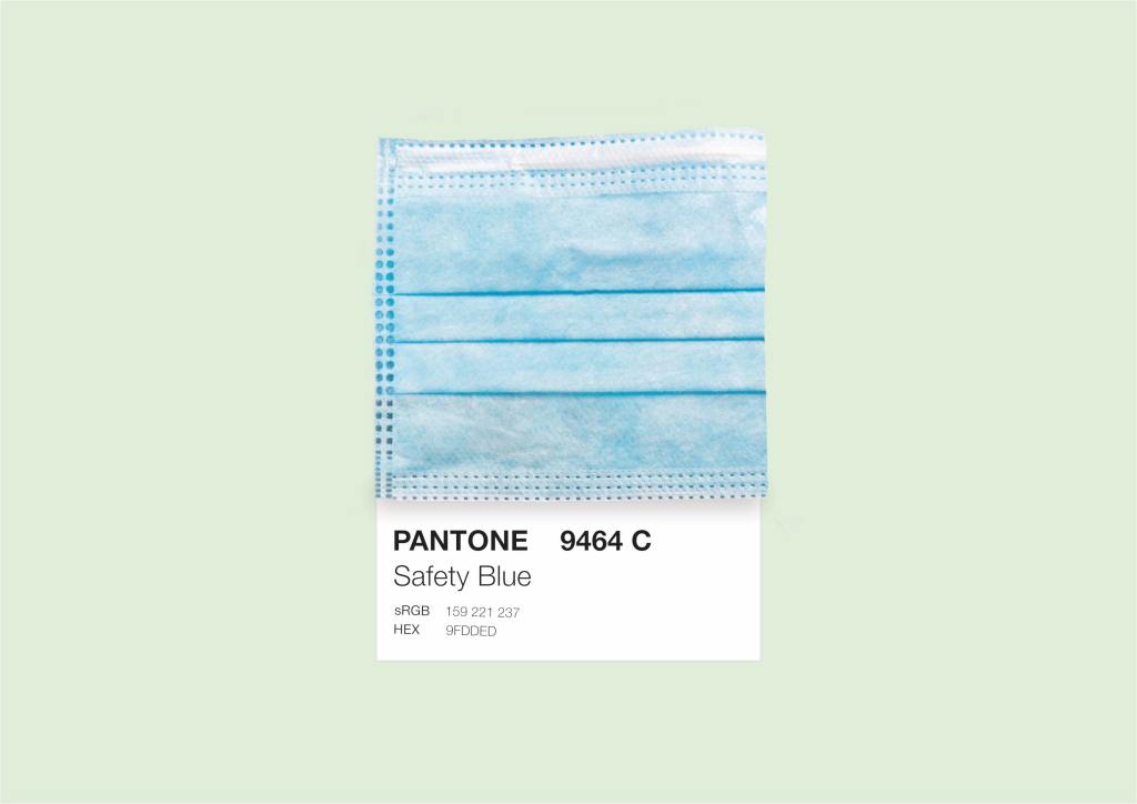
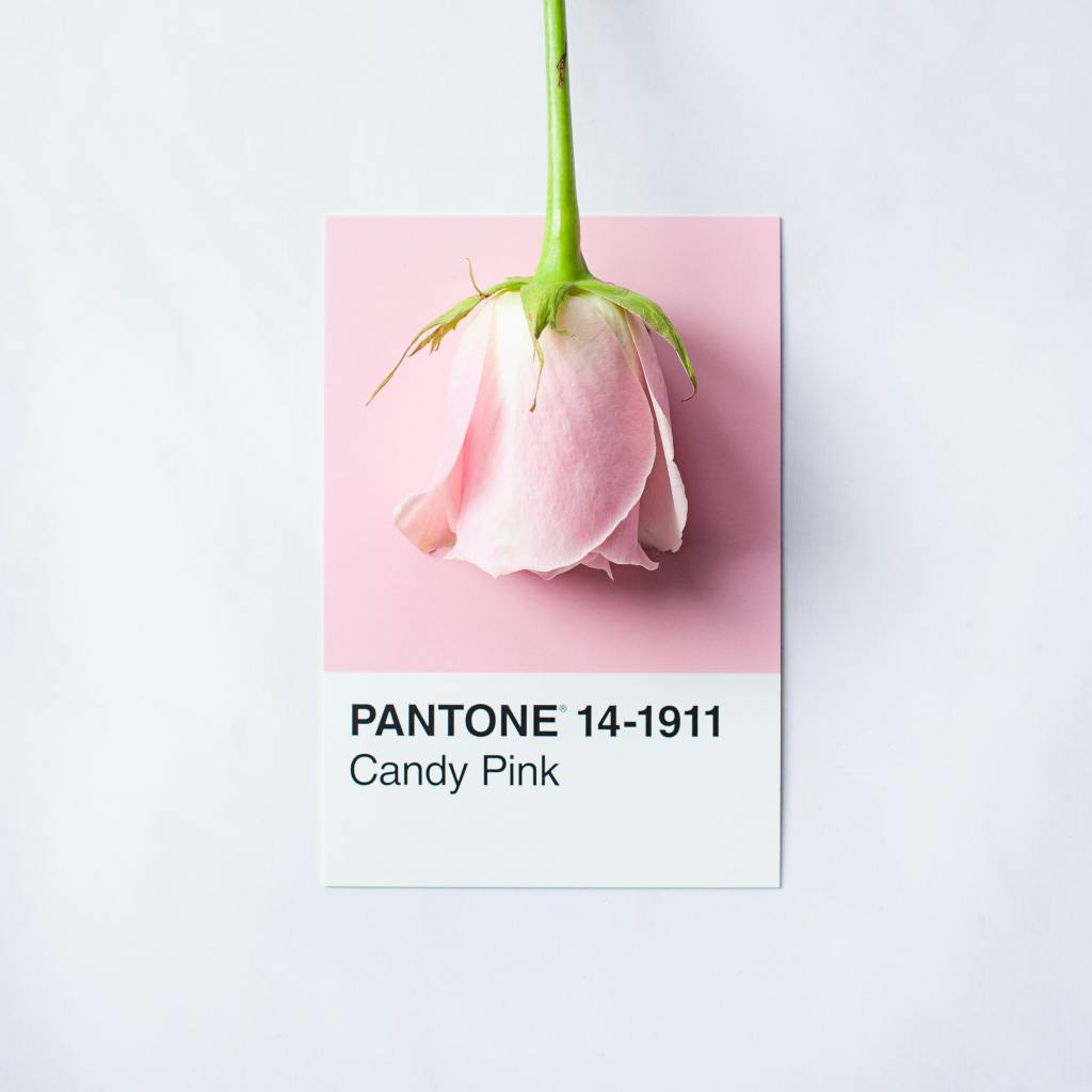
PMS is a color classification system. Each color – on the basic scale of 1761 (yes, in basic scale there are 1761 colors!) – is made up of a mixture of different pigments in certain proportions. We can call it a color recipe. Take, for example, the usual situation of mixing two paints to create a new color – many people have this kind of experience from school from art classes, or from painting a bench in their own garden.
Pantone became a leader in the world of colors. The colors are classified and described in special templates; each color has a number and a name. Besides all this, Pantone started using color as a tool to transfer content and communicate trends. To fully understand what follows, we have to think about what a trend exactly is. The trend is neither less nor more colors, surfaces, styles, products + human behaviors, needs, emotions, inspirations.
From trends, we are moving smoothly to talk about “zeitgeist”, a concept from German philosophy, which means “spirit of the age”. To understand the spirit of the age is to understand ever-changing needs, interests, influences, and dreams. And this is where color enters the red carpet.
According to Pantone, color “has always been an integral part of how a culture expresses the attitudes and emotions of the times”. The color of the year then symbolizes and illustrates what society is living today. From the year 2000, starting with Cerulean, which is a shade of blue, to 2020 with its Classic Blue, we are having the color of the year selection process, which resembles meetings of the cream of society in Hollywood. In the world of trends and design, lots of people wait for the color of the year to be announced every year.
What is the color of 2021? Well, Pantone for the second time in history chose not one but two colors. The first time, in 2016, two colors were announced – Rose Quartz and Serenity were combined to put in a spotlight how in the culture we perceive gender equality and to indicate open communication between the genders and their bonding and interpenetration.
So, ladies and gentlemen, let us introduce Pantone Colors of the Year 2021… Ultimate Gray & Illuminating. “A marriage of color conveying a message of strength and hopefulness that is both enduring and uplifting”, according to Pantone. “Practical and rock-solid”, a neutral shade of gray gives peace, confidence, and support, while “warming and optimistic” yellow gives hopes for a better tomorrow. Can you see this light at the end of the tunnel?
Ewelina Chańska
Sources:
https://www.instagram.com/worqshop/
http://citydesign.pl/pantone-krotka-historia-koloru/
https://en.wikipedia.org/wiki/Pantone
https://www.pantone.com/color-of-the-year-2021

Leave a comment